plotpsddocumentation
This function plots a power spectral density of a time series using theperiodogramfunction.Requires Matlab's Signal Processing Toolbox.
Back to Climate Data Tools Contents.
Contents
Syntax
plotpsd(y,Fs) plotpsd(y,x) plotpsd(...,LineProperty,LineValue) plotpsd(...,'logx') plotpsd(...,'db') plotpsd(...,'lambda') h = plotpsd(...)
Description
plotpsd(y,Fs)plots a power spectrum of 1D arrayyat sampling frequencyFsusing theperiodogramfunction. Sampling frequencyFsmust be a scalar.
plotpsd(y,x)plots a power spectrum ofyreferenced to an independent variablex. This syntax requiresxandyto be of equal length andxmust be equally spaced and monotically increasing. For time series,xlikely has units of time; for spatial analysisxmay have units of length.
plotpsd(...,LineProperty,LineValue)specifies the plot's line style with any combinations of LineSpec properties (e.g.,'color','r','linewidth',2, etc).
plotpsd(...,'logx')specfies asemilogxplot.
plotpsd(...,'db')plots power spectrum in decibels.
plotpsd(...,'lambda')labels horizontal axis as wavelengths rather than the default frequency. Note, this syntax assumes lambda = 1/f.
h = plotpsd(...)returns a handlehof the plotted graphics object.
Example 1: Train whistle
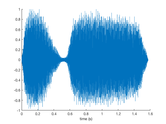
Using the inbuilttrainwhistle example, plot start by plotting the time series for context:
loadtraint = (0:length(y)-1)/Fs; plot(t,y) boxoffxlabel'time (s)'
If you have headphones on, you can play that train whistle like this:
soundsc(y,Fs)
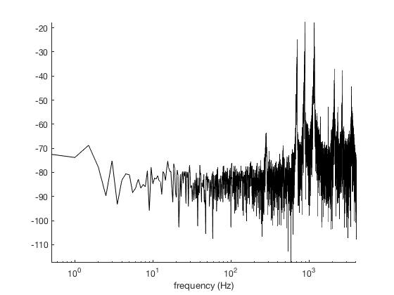
交易的功率谱in signal looks like this:
plotpsd (y, Fs)包含'frequency (Hz)'
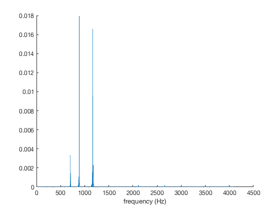
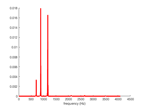
This makes the three horns of the train quite clear! Don't like the default thin blue line? Plot a fat red line instead:
plotpsd(y,Fs,'color','red','linewidth',4) xlabel'frequency (Hz)'
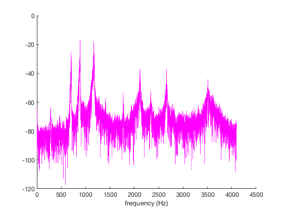
Want to see that as a magenta line plotted in decibels?
plotpsd(y,Fs,'m','db') xlabel'frequency (Hz)'
Here's a black line with decibels on the vertical scale and a log scale in the horizontal direction.
plotpsd(y,Fs,'k','db','logx') axistightxlabel'frequency (Hz)'
Suppose you have some measurementsytied to some time vectortand you don't want to go through the effort of calculating the sampling rate. If this is the case, simply entertinstead ofFs:
plotpsd(y,t,'b:','logx') xlabel'frequency (Hz)'

Example 2: Sea ice extent
Load this sea ice extent data that comes with CDT, and only use data from after 1988 because the stuff before then wasn't at daily resolution:
loadseaice_extent.mat% some sample data that comes with CDT% Indices of dates since 1989:ind = t>datetime(1989,1,1); figure plot(t(ind),extent_N(ind)) ylabel'northern hemisphere sea ice extent (10^6 km^2)'boxoff% removes the ugly, contraining frameaxistight

That clearly has some periodicity to it. We can usedoyto make a scatterplot of all the data relative to the julian day of year:
jday = doy(t); scatter(jday(ind),extent_N(ind),10,datenum(t(ind)),'filled') cb = cbdate('yyyy');% formats the colorbar as datesset(cb,'ydir','reverse')% flips the colorbar axisaxistightylabel'northern hemisphere sea ice extent (10^6 km^2)'xlabel'day of year'
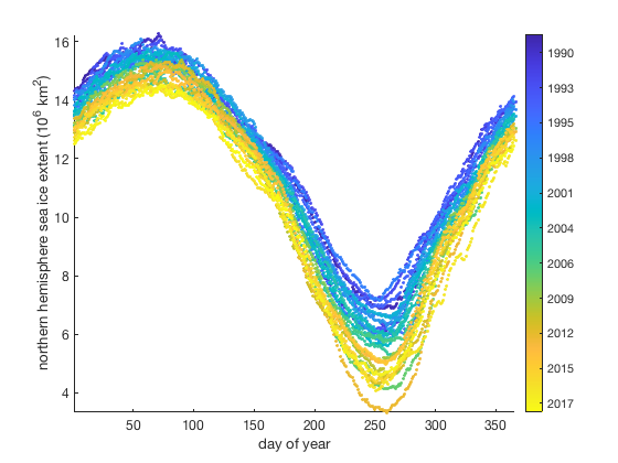
From the two figures above, we can expect the sea ice extent time series to have energy at the 1/yr frequency in addition to some long term trends which should be represented as broadband energy in the low frequencies.
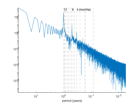
Plot the power spectral density as a function of period (here, lambda), assuming a sampling frequency of 365.25 equally-spaced samples per year:
figure plotpsd(extent_N(ind),365.25,'lambda') set(gca,'xscale','log','yscale','log') axistightxlabel'period (years)'

As expected, a peak at the 1 year period stands out. But there are also a few other minor peaks, particularly at the 6-month and 4-month periods. Usevlineto show them:
vline((1:12)/12,'--','color',rgb('gray')) yl = ylim;% y limits of the plottext(12/12,yl(2),'12','vert','top') text(6/12,yl(2),'6','vert','top') text(4/12,yl(2),'4 (months)','vert','top')
Author Info
This function and supporting documentation were written byChad A. Greeneof the University of Texas at Austin's Institute for Geophysics (UTIG), October 2015. Adapted for the Climate Data Toolbox in 2019.