 Cleve’s Corner: Cleve Moler on Mathematics and Computing
 Loren on the Art of MATLAB
 Steve on Image Processing with MATLAB
 Guy on Simulink
 Deep Learning
 Developer Zone
 Stuart’s MATLAB Videos
 Behind the Headlines
 File Exchange Pick of the Week
 Hans on IoT
 Student Lounge
 MATLAB Community
 MATLAB ユーザーコミュニティー
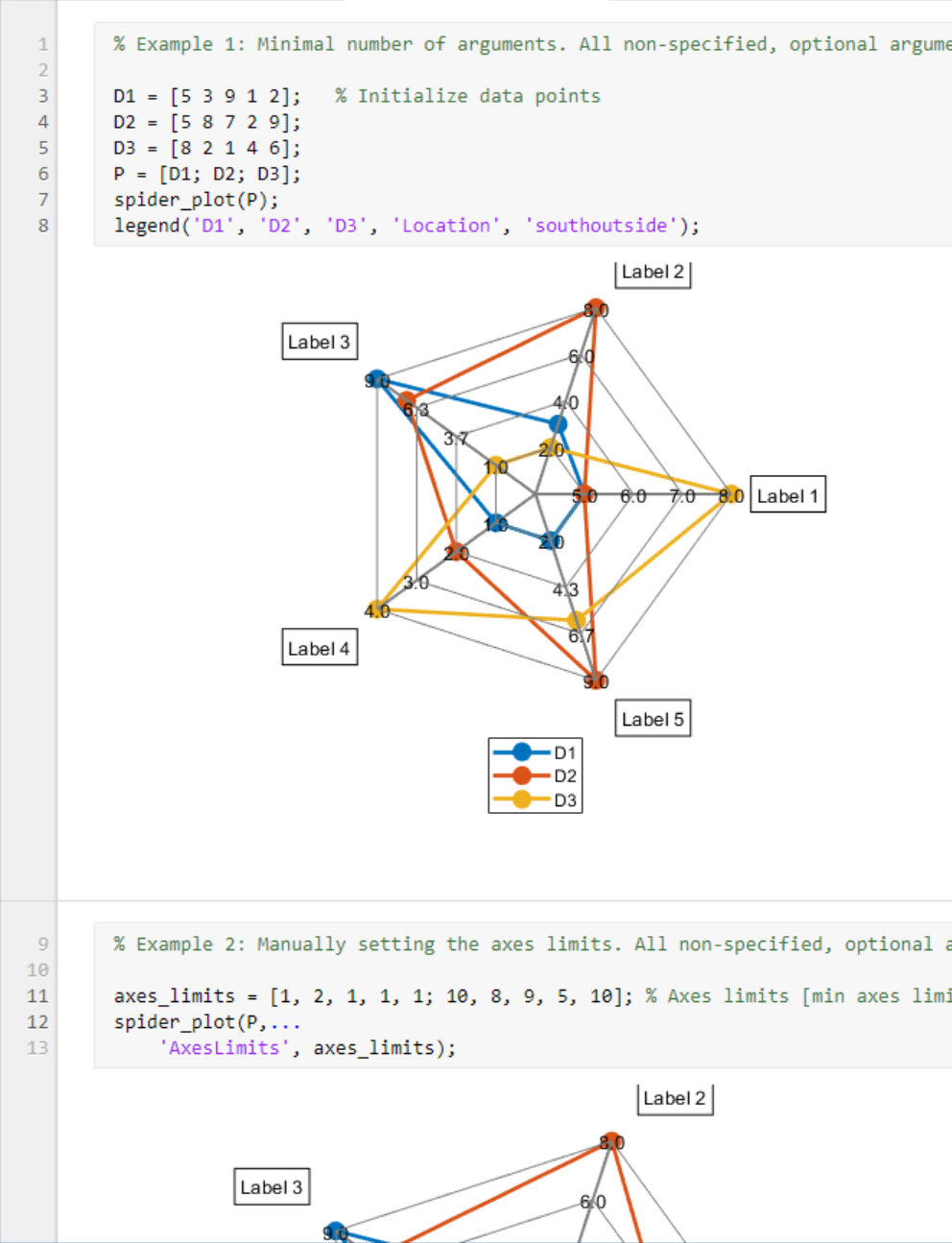
Spider Plot II – Custom Charts (Intro)
Sean‘s pick this week isspider_plotbyMoses.
Contents
Custom Charts
My pick this week is alsospider_plotwhich Jiropicked a few months ago. Jiro added argument validation, of which we’re obviously big fans(!), to it. Here, I’m going to take it a step further and create acustom chartfor it; this is also a new R2019b feature.
If you look at the signature forspider_plotnow, it does not return an output argument. If you want to change it after it’s created, you either need to find the underlying graphics objects usingfindobjand adjust them, or delete and recreate the chart, probably by clearing the axes withcla. The pieces of the spider_plot may show up in the graphics hierarchy, but the spider_plot itself will not. Because they’re not encapsulated, a user could corrupt them accidentally or struggle to make a change that looks like what they want.
By creating a custom chart we get the benefits of encapsulation, our object appearing in the graphics hierarchy, automatic input handling, and give a chart user the same experience they would have with a MathWorks authored chart (e.g.confusionchart,的热图). Additionally, and possibly most importantly, by creating a custom chart, we can tie into the automatic updates in the graphics system hierarchy caused bydrawnowin order to be efficient about updates.
Using the Custom Chart
Over the holiday downtime, I converted Moses’spider_plotto a custom chart, I’ve creatively namedSpiderChart. Today, let’s just play with the finished chart.
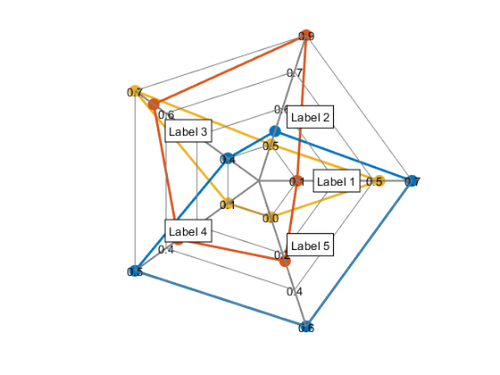
s = SpiderChart(rand(3,5))
s = SpiderChart with properties: P: [3×5 double] AxesInterval: 3 AxesPrecision: 1 AxesLimits: [] FillOption: off FillTransparency: 0 Color: [7×3 double] LineStyle: '-' LineWidth: 2 Marker: 'o' MarkerSize: 8 LabelFontSize: 10 TickFontSize: 10 AxesLabels: [1×100 string] DataLabels: [1×100 string] Position: [0.1300 0.1100 0.7750 0.8150] Units: 'normalized' Use GET to show all properties
You can see that the returned object is aSpiderChart. Now, let’s adjust the filling:
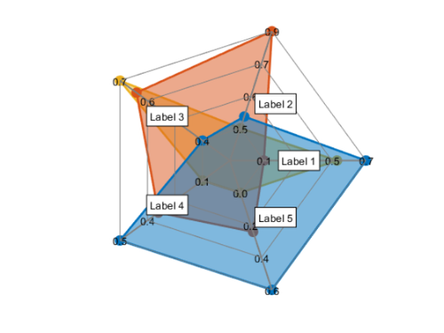
s.FillOption ='on'; s.FillTransparency = 0.5;
And adjust the label of the third axis.
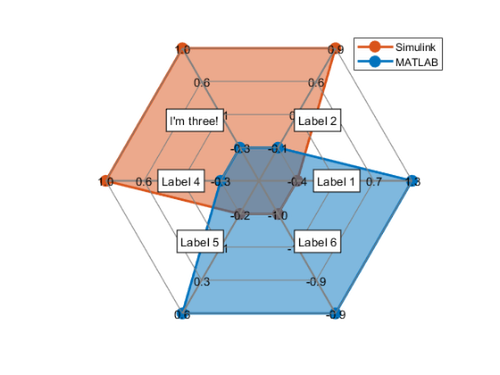
s.AxesLabels(3) =“我三!”;

What about if the data change?
s.P = randn(2,6);

See how everything updated for this?
s.DataLabels = ["MATLAB""Simulink"]; legendshow
Next week, we’ll look at authoring the custom chart!
Comments
Do you have a use for custom charts or a chart you would like MathWorks to make?
Give it a try and let us know what you thinkhereor leave acommentfor Moses.
Published with MATLAB® R2020a
- Category:
- Advanced MATLAB,
- Picks


Comments
To leave a comment, please clickhereto sign in to your MathWorks Account or create a new one.