 Cleve’s Corner: Cleve Moler on Mathematics and Computing
 Loren on the Art of MATLAB
 Steve on Image Processing with MATLAB
 Guy on Simulink
 Deep Learning
 Developer Zone
 Stuart’s MATLAB Videos
 Behind the Headlines
 File Exchange Pick of the Week
 Hans on IoT
 Student Lounge
 Startups, Accelerators, & Entrepreneurs
 MATLAB Community
 MATLAB ユーザーコミュニティー
Data Visualization shows the global temperature change since 1850
Here’s the understatement of the day: There is renewed attention on climate change and governmental policy.
AForbesarticle, “Breaking Down The Climate Change Debate: The Three Areas That Matter Most,” identified specific topics of debate within the broader conversation about climate change. They were the degree of warming, the impacts of warming, and how policy should address climate change.
While the climate debate isn’t new, it can be difficult to fully understand the rate of change from facts and figures quoted in news reports. So scientists are finding new ways to illustrate existing data. This will help address the first issue in theForbesarticle: How much warmer is the world today?
The Climate Change Spiral
Dr. Ed Hawkins’ global warming spiral shows the extent of global temperature increase from 1850 to the present. It eloquently depicts how dangerously close we are to a 2-degree Celsius increase in global temperature since pre-industrial days.
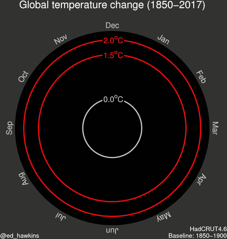
Image creit: Prof. Hawkins
According toThe Washington Post, “… climate scientistEd Hawkinsmade headlines with astunning animated visualizationof the change in global temperature over the past 150 years. The visualization was shared thousands of times and covered by numerous news outlets touting its simple and effective demonstration of the progression of global warming over time.”
For the original gif, I wanted to try and visualise changes in global temperatures in different ways to learn about how we might improve our communication. The spiral presents the information in a straightforward way which appears to resonate with people.
The pace of change is immediately obvious, especially over the past few decades. The relationship between current global temperatures and the internationally discussed target limits are also clear without much complex interpretation needed.
The colours represent time. Purple for early years, through blue, green to yellow for most recent years. The colour scale used is called ‘viridis’ and thegraphics were made in MATLAB. – Dr. Ed Hawkins.
Dr. Hawkins, a climate scientist at the University of Reading, launched his blogThe Climate Lab Bookas a tool to foster discussion among climate scientists. He explains why data visualization is critical:
My research focuses on understanding climate variability and change. My blog is a forum for open discussion of many different climate science topics, especially where the communication of the issues is potentially controversial or liable to misinterpretation. I use MATLAB for data analysis because it can handle the very large datasets produced in climate science.
The blog has had helpful discussions about many aspects of climate change science, but also visualisation, such as our #endrainbow campaign to reduce the use of rainbow colour schemes, such as jet. Obviously, MATLAB has made a step forward by switching thedefault colour scheme to parula.
This particular form of data visualization has proven exceptionally popular. The animated GIF was first seen in aCNNarticle,2016 to be hottest year yet as April smashes records. The original GIF has been retweeted over 15,000 times.
Here are a few additional GIFS from Dr. Hawkins Cklimate Lab Book:
Artic sea ice volume
“Daily Arctic sea ice volume is estimated by thePIOMASreconstruction from 1979-present, producing an inwards spiral as the volume of sea ice reduces.”
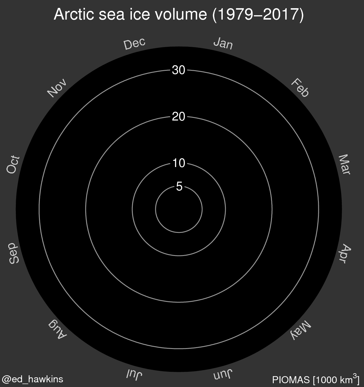
Image credit: Dr. Ed Hawkins, @ed_hawkins, from The Climate Lab Book.
Atmosphericcarbon dioxide concentration
“A recent paper byBetts et al.表明,大气中碳水化合物的浓度n dioxide would not dip below 400ppm in our lifetimes. This is the spiral of CO2 at Mauna Loa in Hawaii, showing the increase since 1958 and the small seasonal cycle.”
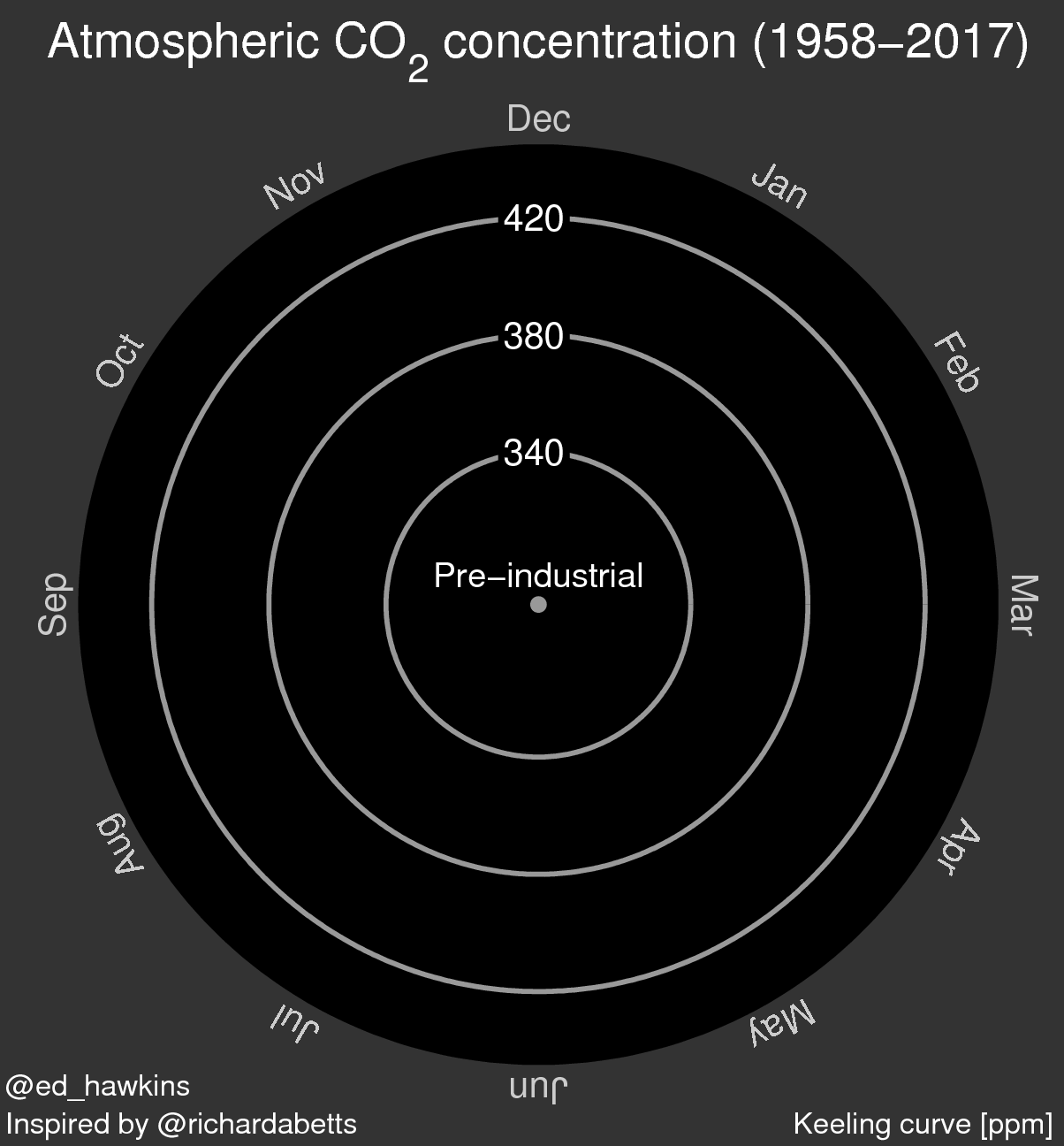
Image credit: Dr. Ed Hawkins, @ed_hawkins, from The Climate Lab Book.


Comments
To leave a comment, please clickhereto sign in to your MathWorks Account or create a new one.