Export Plots in Classification Learner App
After you create plots interactively in the Classification Learner app, you can export your app plots to MATLAB®figures. You can then copy, save, or customize the new figures. Choose among the available plots:scatter plot,并行坐标图,混淆矩阵,ROC curve, andminimum classification error plot。
Before exporting a plot, make sure the plot in the app displays the same data that you want in the new figure.
On the分类学习者tab, in theExport节n, clickExport Plot to Figure。该应用程序从选定的图创建一个图。
The new figure might not have the same interactivity options as the plot in the Classification Learner app. For example, data tips for the exported scatter plot show onlyX,Yvalues for the selected point, not the detailed information displayed in the app.
Additionally, the figure might have a different axes toolbar than the one in the app plot. For plots in Classification Learner, an axes toolbar appears above the top right of the plot. The buttons available on the toolbar depend on the contents of the plot. The toolbar can include buttons to export the plot as an image, add data tips, pan or zoom the data, and restore the view.

Copy, save, or customize the new figure, which is displayed in the figure window.
To copy the figure, selectEdit>Copy Figure。For more information, seeCopy Figure to Clipboard from Edit Menu。
To save the figure, select文件>Save As。Alternatively, you can follow the workflow described inCustomize Figure Before Saving。
To customize the figure, click the Edit Plot button
 在图工具栏上。Right-click the section of the plot that you want to edit. You can change the listed properties, which might includeColor,Font,Line Style, and other properties. Or, you can use theProperty Inspector改变图的属性。
As an example, export a scatter plot in the app to a figure, customize the figure, and save the modified figure.
In the MATLAB Command Window, read the sample file
fisheriris.csvinto a table.fishertable = readtable('fisheriris.csv');Click theAppstab.
In theApps节n, click the arrow to open the gallery. UnderMachine Learning and Deep Learning, click分类学习者。
On the分类学习者tab, in the文件节n, click新会话
 。
。在工作区对话框的新会话中,选择表
fishertablefrom theData Set Variablelist.ClickStart Session。分类学习者creates a scatter plot of the data by default.
Change the predictors in the scatter plot to
PetalLength和PetalWidth。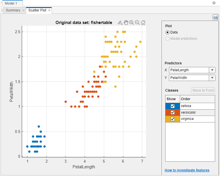
On the分类学习者tab, in theExport节n, clickExport Plot to Figure。
在新图中,单击“编辑图”按钮
在图工具栏上。右键单击与versicolor虹膜相对应的图中的点。在上下文菜单中,选择Color。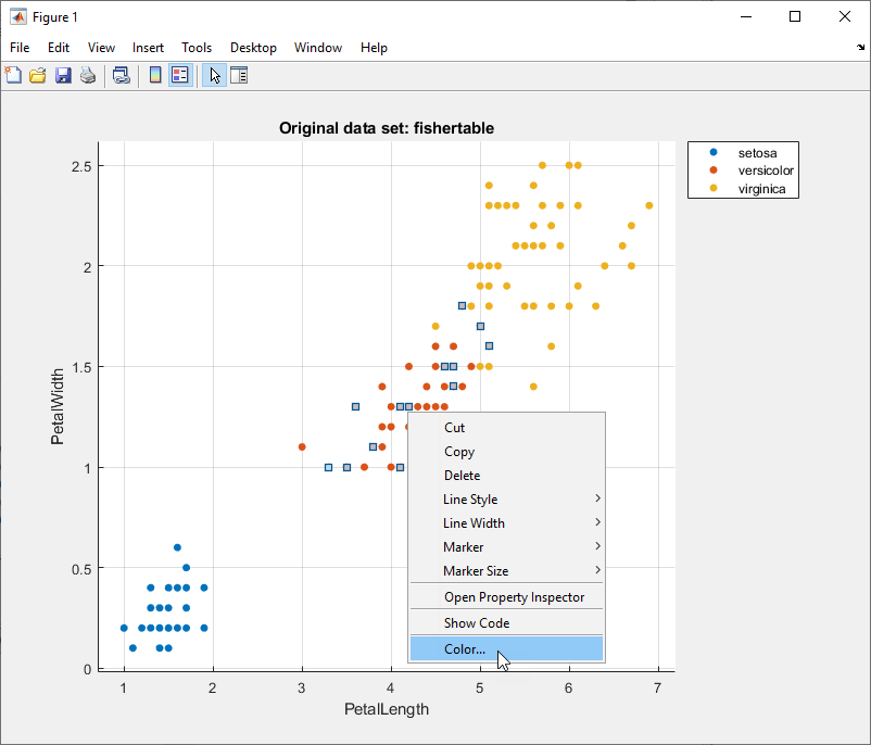
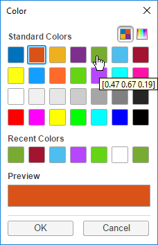
In the Color dialog box, select a new color and click好的。
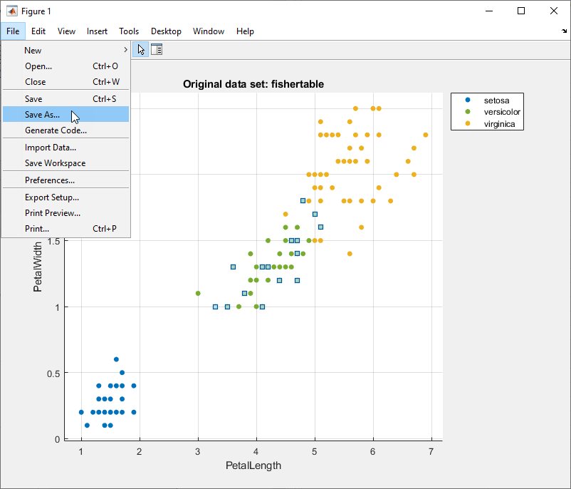
To save the figure, select文件>Save As。Specify the saved file location, name, and type.


相关话题
You can also select a web site from the following list:
Americas
- AméricaLatina(Español)
- Canada(English)
- United States(English)
Europe
- Belgium(English)
- 丹麦(English)
- Deutschland(德意志)
- España(Español)
- Finland(English)
- 法国(Français)
- 爱尔兰(English)
- Italia(Italiano)
- Luxembourg(English)
- Netherlands(English)
- 挪威(English)
- Österreich(德意志)
- Portugal(English)
- Sweden(English)
- Switzerland
- United Kingdom(English)