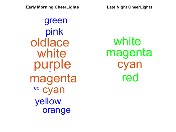
Visualize Data
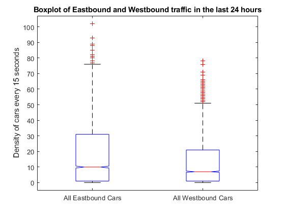
See your data using MATLAB add-on toolboxes. Visualize a histogram, boxplot, or map of your data.
Topics
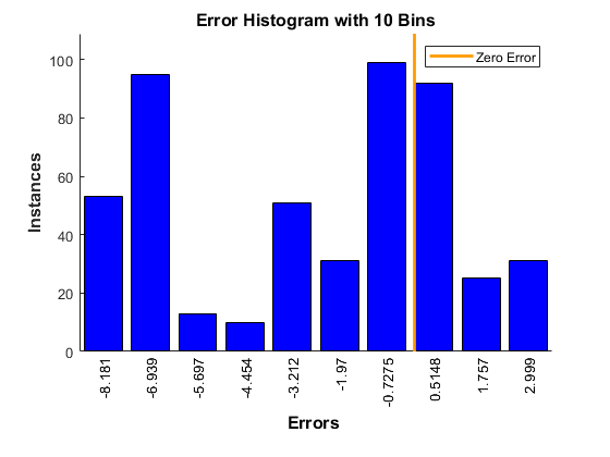
Plot a Histogram with a Distribution Fit
This example shows how to fit a distribution to data in a ThingSpeak™ channel.
Visualize Wind Speed as a Function of Ambient Temperature and Pressure
This example shows how to visualize the variation of wind speed as a function of ambient air temperature and pressure using Curve Fitting Toolbox™.
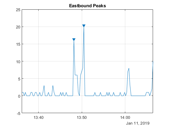
Visualize Abrupt Changes in Signals
This example shows how to determine changes or breakouts in signals using change-point detection.
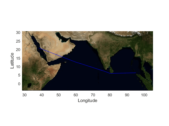
Visualize Path Traversed in Vector Maps
This example shows how to visualize latitude and longitude data in your ThingSpeak™ channel feed on a map.
Visualize Simple Moving Average of Your Data
This example shows how to calculate the simple moving average of a stock price over time and visualize the results.
This example shows how to construct a timetable and plot the moving average convergence/divergence (MACD) indicator.
Create a Candle Plot with Customized Date Axis
This example shows how to generate a candle plot with a customized date axis for the end of the most recent full business day.
Plot Data Read from ThingSpeak Channel
Read and Plot ThingSpeak Data
Featured Examples
Select a Web Site
Choose a web site to get translated content where available and see local events and offers. Based on your location, we recommend that you select:.
Selectweb siteYou can also select a web site from the following list:
Americas
- América Latina(Español)
- Canada(English)
- United States(English)
Europe
- Belgium(English)
- Denmark(English)
- Deutschland(Deutsch)
- España(Español)
- Finland(English)
- France(Français)
- Ireland(English)
- Italia(Italiano)
- Luxembourg(English)
- Netherlands(English)
- Norway(English)
- Österreich(Deutsch)
- Portugal(English)
- Sweden(English)
- Switzerland
- United Kingdom(English)