 Cleve’s Corner: Cleve Moler on Mathematics and Computing
 Loren on the Art of MATLAB
 Steve on Image Processing with MATLAB
 Guy on Simulink
 Deep Learning
 Developer Zone
 Stuart’s MATLAB Videos
 Behind the Headlines
 File Exchange Pick of the Week
 汉斯在物联网上
 学生休息室
学生休息室 Startups, Accelerators, & Entrepreneurs
 MATLAB Community
 matlabユーザーコミュニティー
Taking the Pulse of MOOCs
Courserais a technology platform that kickstarted the currentMOOCsboom. Even though there are more MOOCs players now, it still remains one of the leading companies in this space. But how are they doing these days for delivering higher education to the masses online?
Today's guest blogger,Toshi Takeuchi, would like to share an analysis using Courera's data.
I am a big fan of MOOCs and I benefited a lot from free online courses on Coursera, such as Stanford'sMachine Learningcourse. Like many websites these days, Coursera offers its data throughREST API. Coursera offers a number of APIs, but Catalog APIs are available without OAuth authentication. We can find out the details of courses offered by Coursera with these APIs.
We can try to answer questions like"how do STEM and non-STEM courses break down among universities?"
Contents
JSON support in R2014b
JSONis a very common data format for REST APIs, and Coursera's APIs also returns results in JSON format. MATLAB now supports JSON out of the box inR2014b. You could always use JSON from within MATLAB by taking advantage of user contributed MATLAB programs onFile Exchange, but built-in JSON support makes it easy for us to share scripts that use JSON, because we don't have to worry about dependencies.
Let's try the new feature using Coursera APIs. Calling a REST API is very simple withwebread.
restApi='https://api.coursera.org/api/catalog.v1/courses'; params ='sessions,universities,categories'; resp=webread(restApi,'includes',params,weboptions('Timeout',60));
webreadreturns the JSON response as a structure array. The data is further processed in a separate scriptprocessData.m- check out the details if interested.
We need to decide which categories represent STEM subjects. When there are multiple categories assigned to a given course, we treat it as a STEM course as long as one of them is included in STEM categories.
processData
STEM categories 'Computer Science: Theory' 'Economics & Finance' 'Medicine' 'Mathematics' 'Physical & Earth Sciences' 'Biology & Life Sciences' 'Computer Science: Systems & Security' 'Computer Science: Software Engineering' 'Engineering' 'Statistics and Data Analysis' 'Computer Science: Artificial Intelligence' 'Physics' 'Chemistry' 'Energy & Earth Sciences'
Plotting courses vs sessions by university
As a sanity check, let's plot the number of courses vs. number of sessions by university. A single course can be offered repeatedly in multiple sessions. Therefore you can determine the longevity or age of a given course by the count of sessions.
If it is a new course, or it was not repeated, then you only have one session per course. We can use this as the baseline, and check how universities scaled up their courses relative to this baseline.
R2014b comes with new MATLAB Graphics System, but you can still use the familiar commands for plotting.
% group by number of coursesgrouping = ones(height(universities),1)*2; grouping(universities.courses > 25) = 1; grouping(universities.courses <= 10) = 3;% plotfigure gscatter(universities.courses,universities.sessions,grouping) h = refline(1,0); set(h,'Color','m','LineStyle',':') h = refline(2,0); set(h,'Color','m','LineStyle',':') h = refline(3,0); set(h,'Color','m','LineStyle',':') h = refline(6,0); set(h,'Color','m','LineStyle',':') xlabel('Number of Courses');ylabel('Number of Sessions');标题('\fontsize{14} Courses by Sessions by University');传奇(“有25多个课程的大学”,'Universities with 10+ courses',...'Universities with 1-10 courses','Ref line: 1 session per course',...'Ref line: 2 sessions per course','Ref line: 3 sessions per course',...'Ref line: 6 sessions per course','Location','NorthWest')% add university namesfori = 1:height(universities)if& & universities.sessi universities.courses (i) > 10ons(i) > 20 text(universities.courses(i),universities.sessions(i),...universities.shortName{i},'FontSize',12)endend
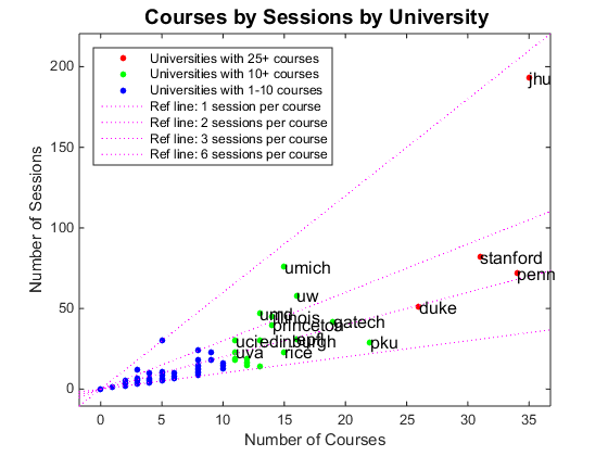
You can see that Stanford, Penn (University of Pennsylvania), JHU (Johns Hopkins), and Duke are leading the pack. They are the early adopters, based on the number of sessions. It is interesting to see PKU (Peking University) leading international institutions. They offer a number of courses in Chinese. Coursera didn't start international partnership until recently, so it is quite remarkable the PKU has broadened their online content in relatively short time. More recent entrants are on the left with fewer courses and sessions.
Established players are trying to scale up by repeating the sessions. JHU seems to be particularly aggressive in terms of the number of courses they offer and how they are repeated as sessions.
Plotting STEM ratios by university
Let's plot the number of courses by ratio of STEM courses by university. This will tell us which schools are making investments in online education content, and whether they focus on STEM or non-STEM subjects. The size of the marker indicates the total number of sessions they are associated with, so it also gives us how long they have been involved in Coursera. Notice theparulacolormap used in the colorbar, the new default colormap in R2014b.
% use sesion count for setting marker sizesmarkerSize = universities.sessions;% we need to scale the marker sizemarkerSize = (markerSize - min(markerSize))/(max(markerSize)-min(markerSize)); markerSize = markerSize * 1000; markerSize(markerSize == 0) = 1;%更改刻度标签以反映原始值barticks = num2cell(20:20:200);% create a scatter plotfigure scatter(universities.courses,universities.stem_ratio,markerSize,markerSize,'fill') xlim([0 40]) h = colorbar('TickLabels',barticks); h.Label.String ='\fontsize{11}Number of Sessions'; title('\fontsize{14} Ratio of STEM courses by University on Coursera') xlabel('\fontsize{11}Number of Courses');ylabel('\fontsize{11}Ratio of STEM Courses');% add university namesfori = 1:height(universities)ifuniversities.stem_ratio(i) ~= 0 && universities.stem_ratio(i) ~= 1 && universities.courses(i) >= 5 text(universities.courses(i),universities.stem_ratio(i),universities.shortName{i},'FontSize',12)endend% add reference linesline([25 25],[0 1],'LineStyle',':') line([10 10],[0 1],'LineStyle',':') line([0 40],[0.5 0.5],'LineStyle',':')

Stanford is very heavy on STEM subjects, while others are more balanced. More recent entrants on the left have a wider variance in how STEM heavy their courses are. Perhaps rate of adaption is different among different academic disciplines?
Plotting ratio of courses per category
We can plot the ratio of courses per category in order to see the relative representation of academic disciplines on Coursera. A course can belong to multiple categories, and in such cases a count is split equally across the included categories. Note that you can now rotate axis tick labels in R2014b.
% get the count of categories by universitycatByUniv = zeros(height(universities),height(categories));fori = 1:length(T.categories) row = ismember(universities.id,T.universities(i)); col = ismember(categories.id,T.categories{i}); catByUniv(row,col) = catByUniv(row,col) + 1/length(T.categories{i});end% segment the universities by number of coursescatByTiers = [sum(catByUniv(grouping == 1,:));...sum(catByUniv(grouping == 2,:)); sum(catByUniv(grouping == 3,:))];% get the ranking of categories by number of courses[~,ranking] = sort(sum(catByUniv(universities.courses > 25,:)),'descend');% get the ratio of courses by categorycatByTiers = bsxfun(@rdivide,catByTiers,sum(catByTiers,2));% plot a bar graph图xticks = [{''};categories.name(ranking);{''}]; h = bar(catByTiers(:,ranking)'); xlim([0 26]); ax = gca; set(ax,'XTick',0:26); set(ax,'XTickLabel',xticks);set(ax,'XTickLabelRotation',270); title('\fontsize{14} Ratio of Courses Per Category') legend('Universites with 25+ courses','Universites with 10+ courses','Universites with 1-10 courses','Location','Best')
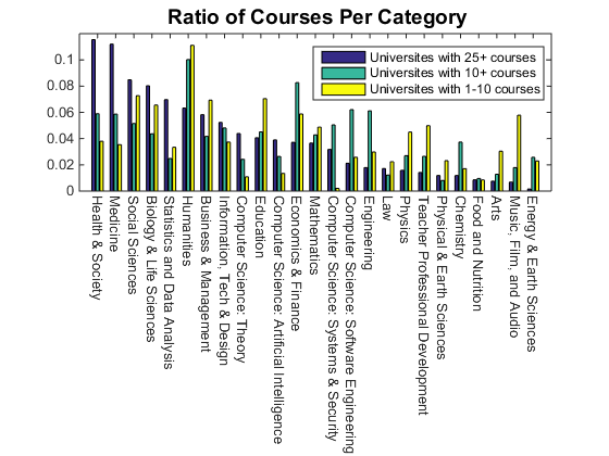
It looks like there was more STEM bias among the early adopters (universities with a lot of courses) but new entrants (universities with fewer courses) tend to have more non-STEM courses. Categories like Social Sciences, Humanities, Business and Management, Education, Teacher Professioal Development, Music, Film and Audio are on the rise.
概括
Why do we see this non-STEM shift? There are a number of possible explanations.
- In the beginning, Coursera courses relied on autograders. They were well suited for quantitative STEM subjects, but not for non-STEM subjects.
- Autograders were custom built for respective courses and they are in fact fullSaaSapplications. It was difficult to scale the number of courses if you needed to build for each course a custom SaaS app that can withstand substantial peak traffic near the deadline -this human behavior is pretty universal
- Later, Coursera introduced a crowd sourced essay grading system that can be used across multiple courses. This freed universities from the burden of creating custom SaaS apps.
- This led to rapid expansion of course offerings and made non-STEM subjects viable. In fact, I took a number of STEM courses from JHU, and they tend to use essay grading system rather than autograders.
有问题我们无法回答with the data at hand. For example, is the shift driven by the convenience of supply side (universities) or by the demand for non-STEM subjects by the public?
There are no strict prerequisites for Coursera courses, but the bar is still high for STEM courses. Therefore it is quite possible that the potential market size is larger for non-STEM subjects.
You also saw how easy it is to use REST API with JSON response within R2014b, and got a quick look at some of the new features of updated MATLAB Graphics System.Download the new release, try those new features yourself and share what you findhere!
- Category:
- New Feature,
- News


Comments
To leave a comment, please clickhereto sign in to your MathWorks Account or create a new one.